Drawing from the past to celebrate our futures – our thoughts on how we chose to present our spirit
Posted Jan 2, 2015
Here is Glynn’s summary of some of the team’s thinking behind the presentation of this premium spirit,
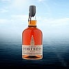
“It has been more than a year since we began developing our packaging concepts for Fortress™ Rum. Fans of our rum may have noticed some of the details that have gone into its presentation and wondered about some of the choices we made in the design process. It was an objective to remain true to the period, and have the look and feel of a traditional rum bottle, while meeting regulatory standards and modern preferences. Our package is truly an assemblage of components from around the world that has involved considerable teamwork to bring this premium product to you. We are appreciative of the support and encouragement of Parks Canada researchers and curators to help us make our presentation as authentic as possible.
Let’s start with the bottle.
Material: Firstly, we chose glass, a reusable and recyclable traditional material. Rum was sometimes shipped in bottles that were wrapped with twisted sugar cane, rope or dried rush to prevent breakage. However, the majority of rum was transported in large barrels and decanted into serving vessels, including glass bottles. It would be diluted at the tavern off the barrel. There was likely considerable inconsistency in alcohol content as a result.
Source: I chose a very high quality French supplier with 120 years of bottle-making experience from a region of the country that has been making bottles since the 15th century. We import bottles by the container load.
Size: The 750 mL spirits bottle is the standard in the industry today, offering convenience to the customer, whether they be at home or having a night out.
Colour: We chose clear glass so the hue of the spirit can be seen. There are green and amber bottles in the collection, and few clear bottles, likely because they were more expensive to produce.
Shape: The shape of the bottle is similar to the European “mallet”-style of rum bottle popular in the period. It fits well in the hand and sits firmly on the table. The punt, a historical characteristic of free blown bottles, provides additional strength and stability to the bottle, and makes them less likely to break during transportation.
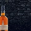
Folks will notice that every bottle is dipped in wax and sealed with a fleurs-de-lils, a symbol of France. This seal is applied painstakingly by hand, one-at-a-time at our distillery.
Material: Wax and pitch were traditional materials used in sealing wine and spirits bottles and samples are found in the Fortress’ collections. They provide a tamper-proof, hard seal, impermeable to the elements.
Source: The wax is custom-blended to our specification and comes from a supplier in California with considerable experience in the wine industry.
Colour: Slate blue was chosen to represent the North Atlantic, right on the Fortress’ doorstep. Blue is often associated with the French military and appears in many variations of the French flag.
Shape: The wax seal on every bottle is different. The hot wax has a mind-of-its-own as it drips down the bottle neck and cools in its unique pattern, showing that each bottle is hand-crafted, as it would have been centuries ago.
Functionality: To open the bottle, a paper strip is pulled breaking the wax seal, a modern convenience.
The stopper design is a traditional bar-top style. (Screw-tops would not have been used in the 18th century.)
Material: Cork or synthetics? This was a tough decision. Cork (bark of the cork tree) would have been used in the period. However, we chose a synthetic cork to reduce losses that occur through a porous cork.
Source: The supplier is one of the world’s largest suppliers of cork and synthetic stoppers with operations in Portugal and North America.
Colour: We chose a colour similar to that of cork and the base colour of the label, which is tan, the colour of the Fortress stone.
Shape: Simple as it is covered by the wax seal.
Our label design required many months of design, prototyping and final production. The label has to not only provide the required information about what the product is, but provide the look and feel of the brand, and what it represents.
Material: The label is made from a special paper that can be written on without smudging. Paper labels were used in the period and were often hand written. The barrel from which the rum is withdrawn is recorded on the back label, showing the pedigree of this handcrafted product.
Source: We selected a Canadian supplier of high quality labels with considerable experience in the wine industry.
Colour: The primary colours are slate-blue, selected for the reasons noted above (see wax colour), and various shades of tan. Tan is the colour of the stone found at the Fortress.
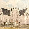
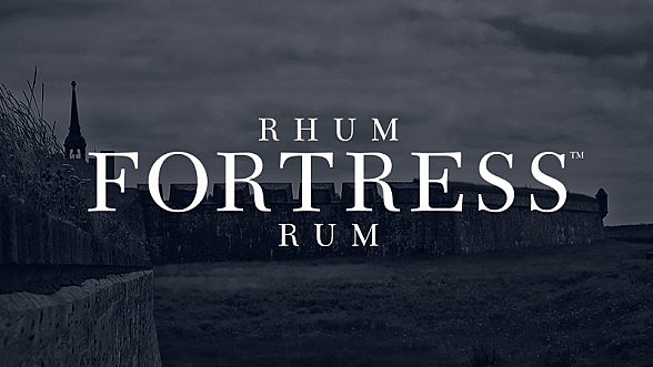
Shape: The front label is a complex shape. It is embossed and de-bossed providing a three-dimensional impression of the King’s Bastion, the centerpiece of the Fortress, with our Rhum Fortress™ Rum name embossed on the front. The lines of the elegant clock tower create an harmonious form with the overall shape of the bottle and its elongated neck.
Content: This bilingual label assists the consumer with the purchase decision-process, conveying the required information about the product contents and its origin, as well as how to find out more about Authentic Seacoast and the Fortress of Louisbourg.
This illustrates the thinking behind the presentation of our Fortress™ Rum – just imagine the attention to detail and care taken to create the spirit itself – it is Worth Protecting.”